Prototypes for user testing
Here are a set of prototypes I worked on for user tests. These were all built with Axure RP.
Each of these prototypes includes ideas for in-product content that provides information for users within the context of the task.
Flexible help menu
This prototype shows a design for new help menu inside the Quick Base Visual Builder, which is the development environment for the product.
The idea for this help menu was to be flexible and modular, like the other elements in Visual Builder. The help menu can appear, be moved around the canvas, or docked to the side.
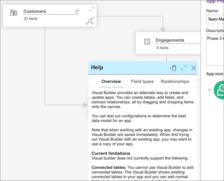
In the prototype, click the ? question mark icon to see the help menu.
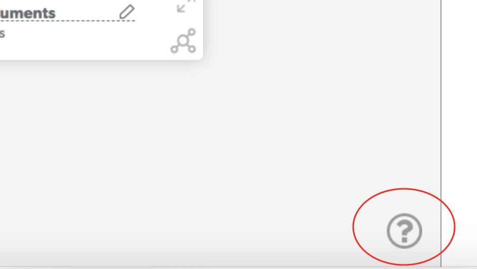
Visit the prototype here: https://of8mbv.axshare.com/home.html
Show tips
This prototype shows a design for toggling in-context instructional text inside the Quick Base Visual Builder.
The inspiration here came from user testing, where customers saw a new visual representation of all the same field types that were always available, but because of the new treatment, they thought some or all were new. The idea for content here was to show easy reminders for each field type, plus allow comparisons among types that are similar.
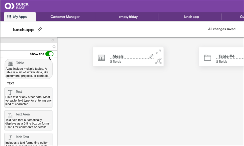
In the prototype, click Show tips to see each field type definition.
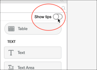
Visit the prototype here: https://q5vnrx.axshare.com/visual_builder.html
Contextual help menu
For usability testing, this prototype showed proposed changes to the Quick Base help menu. Previously, the help menu only included a search box. The new design showed assistance matching the page or task.
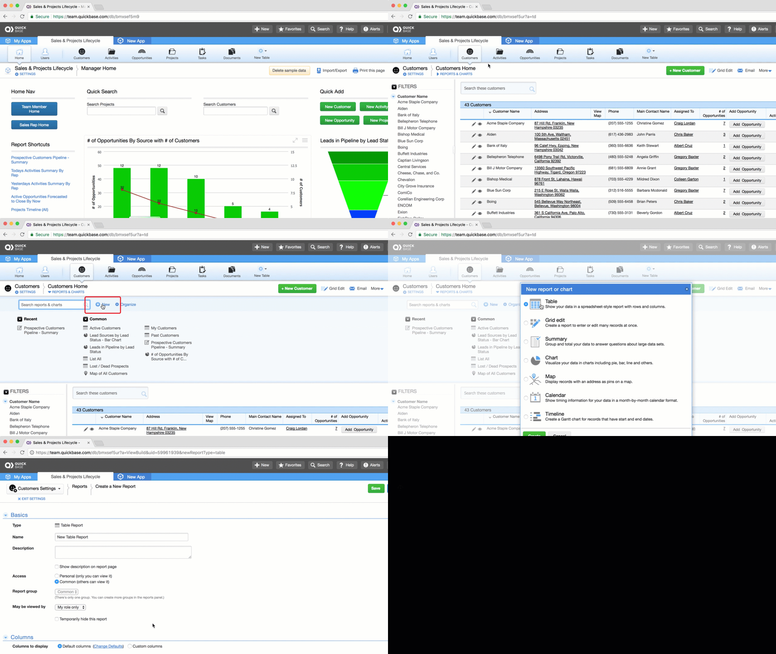
You can follow along the prototype using the task list I used during the user tests.
- Task list: context-help-tasks.pdf
- Visit the prototype here: https://cy70m7.axshare.com/app_home.html