How I built this portfolio
I used GitHub Pages to design and publish this portfolio. You can see the source code repository here: github.com/craiglordan/craiglordan.github.io.
Setup
Here are highlights of the steps I took to get set up. For full instructions, read Working with GitHub Pages.
Create a personal account on GitHub.
Add a public repository in the syntax:
name.github.io. This is required for GitHub Pages to work.In Settings for the repository, in the GitHub Pages section, choose the source branch. This enables Pages for the repository.
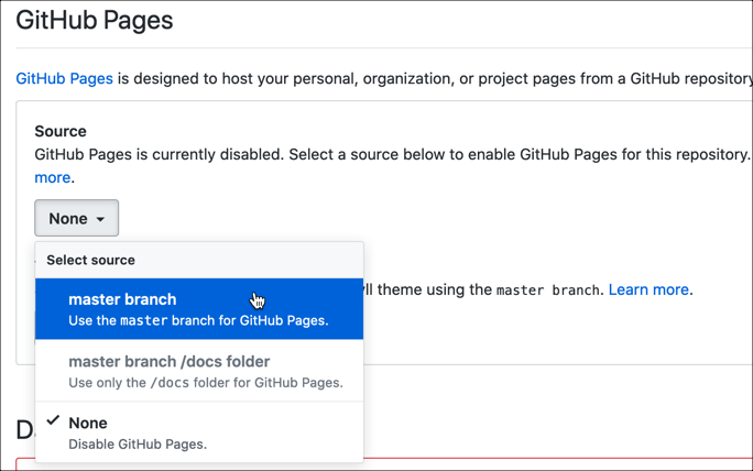
Also in Settings, you can use the Theme Chooser to select how your pages are going to look. There is a set of default Jekyll themes from which you can choose.
If you want to use another Jekyll theme from elsewhere, you can download and add the theme to your repository, then edit the
_config.ymlfile to add these lines:
# Build settings
theme: minima
Theme customization
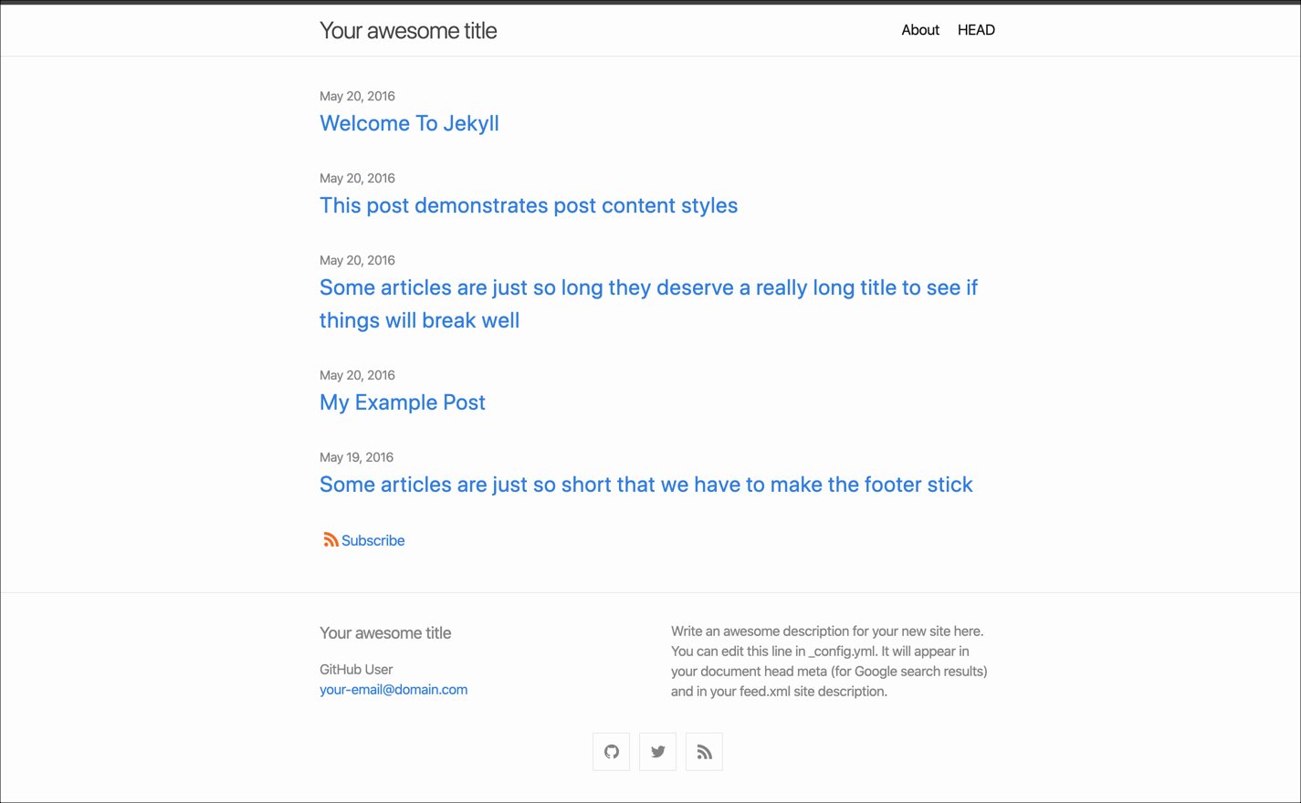
I used the default Jekyll theme, minima, as the basis for this site design.
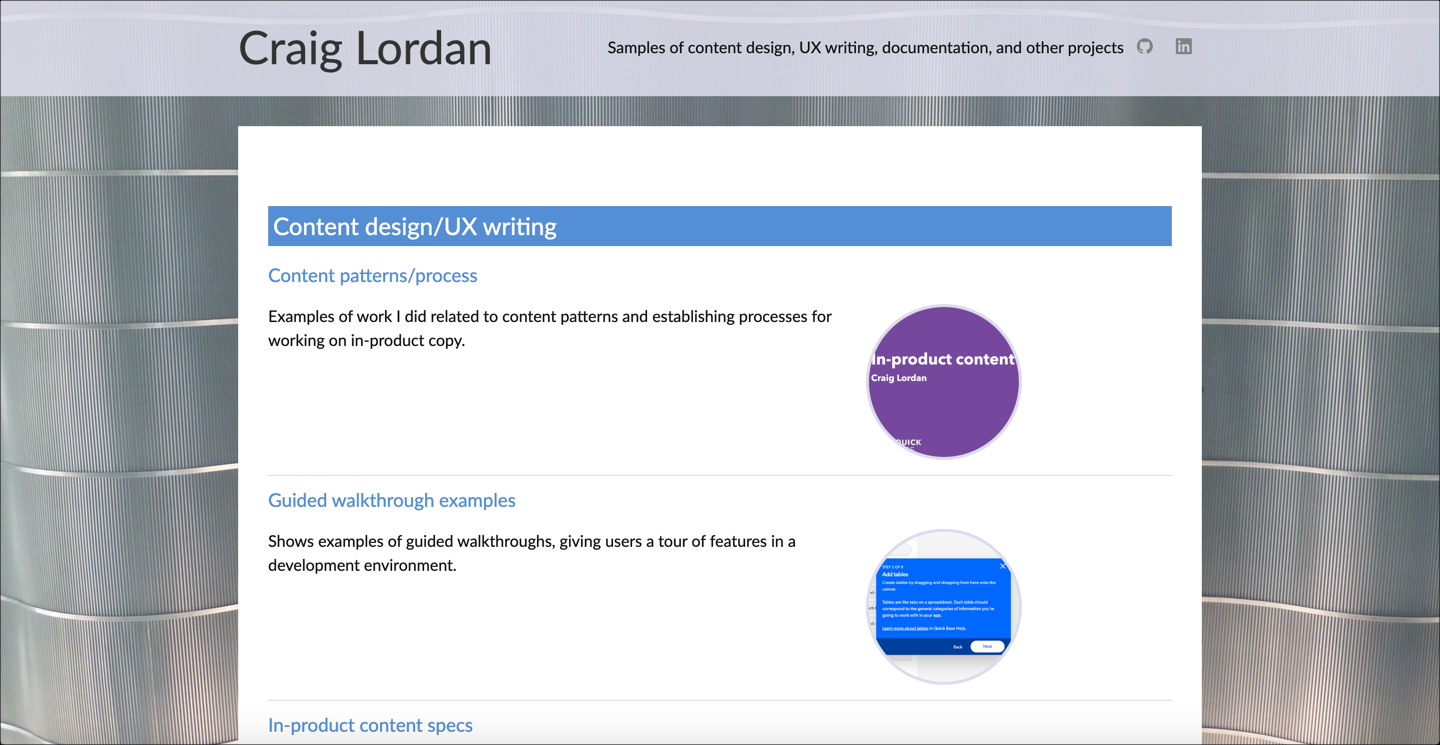
Here are images of the default theme in comparison to this site:
Font
To use the free font Lato, I added these lines to files in the _sass\minima folder:
- custom-styles.scss:
@import url('https://fonts.googleapis.com/css?family=Lato&display=swap'); - initialize.scss:
$base-font-family: Lato
Background image
It took me several attempts to add the background image so that it appeared the way I wanted. The final solution I chose was to add a background to the top-level html tag:
html {
  background: url(/assets/images/portcanaveral-crop.jpg) no-repeat center center fixed;
  -webkit-background-size: cover;
  -moz-background-size: cover;
  -o-background-size: cover;
  background-size: cover;
}
The background image is a photo I took looking directly at the ceiling inside Disney’s cruise terminal at Port Canaveral, Florida. Here’s another angle:
Header and footer
To recreate the same color transparency I had used on a previous workfolio.com portfolio, I changed this styling in _layout.scss:
site-header {
  background-color: rgba(220, 220, 235,.87);
  }

.site-footer {
    background-color: rgba(220, 220, 235,.87);
  }
Assets
GitHub makes it easy to include the actual samples of the portfolio, stored as PDF, video, and image files.
The existing Jekyll theme included an assets folder. I added folders for pdf, images, and videos as the central place to upload samples.
Then I could link to samples like this, using a clickable image as the hotspot and opening the PDF in a new browser tab:
{: width="500"}](/assets/pdf/process-editing-strings.pdf){:target="_blank"}
Home page layout
I customized the home.html file to:
- Display content sorted by category
- Have two columns for each entry (one for the link and excerpt, one for the image)
- Include a formatted image for each entry
- Style headings and rules to help organize the page
This code includes the category sorting and the inline styling to have each thumbnail image appear in a circle:
{% assign sorted_cats = site.categories | sort %}
{% for category in sorted_cats %}
{% assign sorted_posts = category[1] | sort: 'title' %}
  <h2>{{ category[0] }}</h2>
    {% for post in sorted_posts %}
      <h3><a href="{{ post.url }}">{{ post.title }}</a></h3>
      <div class="homerow">
      <div class="homecolumn homeleft">
      {%- if site.show_excerpts -%}
        {{ post.excerpt }}
      {%- endif -%}
      </div>
      <div class="homecolumn homeright">
      <p><img src="{{ post.thumbnail }}" style="border-radius: 50%; border-style: solid; border-color: #dcdceb; width: 150px"/></p>
      </div>
      </div>
    {% endfor %}
{% endfor %}
To have each category heading appear as white text on a blue background, I added this to custom-styles.scss:
.home h2 {
  font-weight: 400;
  line-height: 40px;
  margin-top: 50px;
  padding-left: 5px;
  background-color: #548DD4;
  color: #ffffff
}
To have each entry appear in two columns, I added these entries to custom-styles.scss:
.homecolumn {
  float: left;
}

.homeleft {
  width: 65%;
  margin-right: 10px;
}

.homeright {
  width: 25%;
}

.homerow:after {
  content: "";
  display: table;
  clear: both;
}
But, to be responsive for mobile devices, I also added these lines:
@media screen and (max-width: 600px) {
  .homeleft {
    width: 100%;
  }

  .homeright {
    width: 100%;
  }
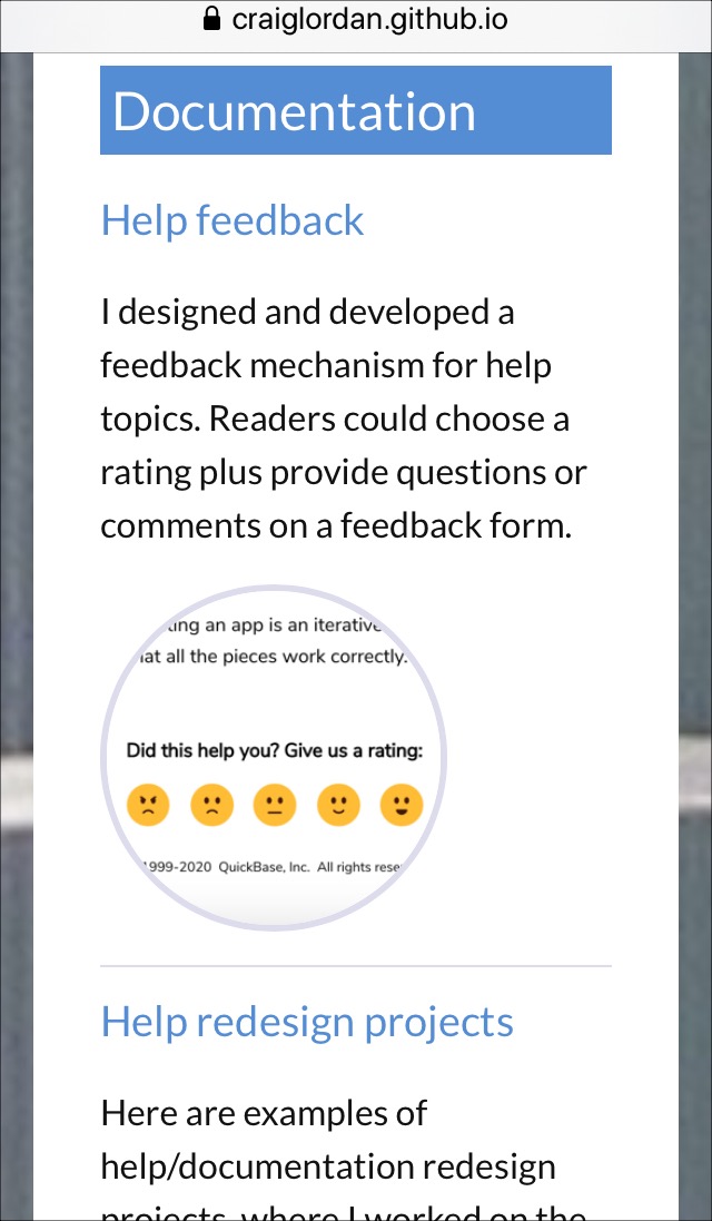
With the styles above, the home page content appears stacked rather than in columns:
Markdown files
When using GitHub Pages, markdown (.md) files are automatically published as web pages. I added markdown files for each of the portfolio entries. I also used some HTML code within some markdown files in order to use other formatting, such as two- and three-column layouts.
This header section includes meta information such as title and category. The permalink shortens the URL path. The thumbnail entry sets the small image that appears on the portfolio home page.
---
title: "Conference presentations"
layout: post
permalink: /speaking/
thumbnail: "/assets/images/thumbnails/ad112-lotus-wikis.png"
categories: [Presentations]
---
This snippet shows a typical piece of content, which includes a header, regular text, and a clickable image that loads one of the samples, stored as a PDF.
Presentations from speaking engagements at customer and industry conferences.
### Development and Deployment of Lotus Product Documentation Wikis
From Lotusphere, the IBM/Lotus customer conference. I spoke with the lead developer from our team about our project to design, develop, and deploy editable wikis for product documentation, using our own Lotus Domino technology.
[{: width="300"}](/assets/pdf/ad112-lotus-wikis.pdf){:target="_blank"}
Tools
- Atom editor for working with all the files, including markdown, HTML, CSS, and YAML.
- GitHub Desktop to manage the commits and push requests.
- TechSmith Snagit for screen captures and image editing.
